
Like this post? Share it!
When Dr. William Yobi took over a classic family dental practice in Youngstown, Ohio, he wanted to give it a modern vibe without losing the hometown heart it’s had since 1958. That’s where INKO came in. We built out a clean brand identity and a super user-friendly website that’s honest, no-nonsense and speaks to a practice and dentist that provides care with the patient always front and center.
As with every project we take on, we started with strategy — understanding the client, the audience, and what makes their story unique. That’s the foundation of all our brand and logo design work, ensuring every identity we build connects visually and emotionally.
From the logo and business cards to the full site and all the words on it, everything ties together to make Yobi Family Dental feel like the go-to spot for families in Youngstown, Boardman, Poland, and pretty much anywhere in the Mahoning Valley.
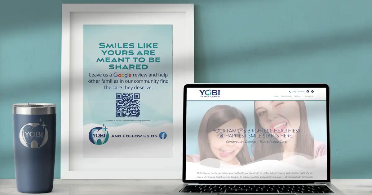
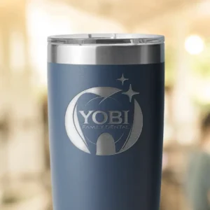
The star of the show is that “O” in YOBI. Doubling as a letter mark wrapped like a warm hug around a sparkling dental icon. We deliberately wove the tooth right into the wordmark instead of sticking it to the side or on top. This brand says, “Hey, this isn’t just teeth stuff, it’s part of your everyday life – integrated and easy.”
Tucked inside the O is a subtle tooth shape, abstract enough not to interfere with legibility, but clear enough to say modern dentistry. Soft teal gradients keep it approachable, not too sterile, and those tiny starbursts? They nod to healthy starts, bright smiles, and that clean, fresh feeling just after a checkup.
Finally, we paired it with a bold serif wordmark that just oozes trust and pro-level confidence. Whether the primary wordmark or the secondary variation for a more iconic look, the whole system flexes across business cards, letterhead, social media, you name it. No matter where you spot it, it feels solid and caring every time.
Alongside this new identity, we designed a user-friendly website that mirrors Yobi’s approachable personality. Like all of our custom website designs, it balances clarity, usability, and conversion—because great design should work as beautifully as it looks.
Once the brand was locked in, INKO rolled out a website for Yobi Family Dental that’s responsive, easy to navigate, and looks sharp without trying too hard. Inviting photos, patient-friendly language, lots of white space, and menus that don’t make the user hunt around—it’s all about making folks feel welcome and at ease right off the bat.
INKO didn’t stop at just making Yobi look good, we nailed the copywriting and content strategy as well. The SEO-rich pages of Dr. Yobi’s main services: Preventive Dentistry, Esthetic & Restorative stuff, Urgent Care, and Dentures & Removables boast content written for real people – easy to skim but sneaking in just enough SEO smarts so it shows up when it counts in search. And we leaned hard into the local angle, ensuring browsers know just how easy it is to swing by from Boardman, Poland, Struthers, or anywhere in the surrounding valley.
This INKO project wasn’t just a facelift—it’s a full-on system that lines up with what Dr. Yobi stands for and is there for him as he grows. Whether online or in the office, it’s the same vibe: a dental practice offering straight-up care patients can count on.
Mixing smart branding, a site that works, and copy that lands, we basically relaunched this Mahoning Valley icon with a now-feel that keeps all the good stuff from day one intact.
From brand story to digital experience, every element of this project reflects our process—strategic, handcrafted, and built to grow. Learn more about how we approach branding and web design for small businesses.